The Challenge

A startup called Cope hired me to create a minimum viable product
for their new idea — tracking mental health. It was the first project
where I handled mobile app design, and I was very excited to learn the
intricacies of the iOS platform.
My clients John and Kat have done some preliminary interviews
with psychologists and psychiatrists to get their side of the picture.
They have established a user persona, a business model canvas, and
several startup prep work for the product to take off. My job was to
actually create the experience for their users and make sure they are
represented in the design process.
The design I created was a result of self-started questions,
validating assumptions, benchmarking, and guerilla testing. I could
have done some more usability studies early in the process, however.
We checked the App Store for similar applications, and we found
out that there were no well-designed niche applications for handling
mental health. We found another app called Cope as well, but their
solution was more of a community-based social sharing platform. We saw
this as an opportunity for our own version of Cope to solve a unique
problem in the space.

Instead, we drew inspiration from applications that feature the
design components we needed: menstrual cycle management apps that have
good summaries and calendars, emotion tracking apps, medicine tracking apps.
I used the concepts gained from these applications to study how
they understood the mental models of their own users and hopefully
replicate that kind of empathy whenever I create design decisions for Cope.
Pivoting
We had feature changes and a lot of design decisions cancelled.
Before, we had different modules for the design: forums, mental health
doctor search, messaging.

We finalized the components of Cope that we wanted to build and
we decided that we wanted to focus on tracking their progress for
mental health. I had to drop some UI explorations I did for the first
version of Cope we were building.
Ideation and Feature Prioritization
How do we exactly track one’s progress in mental health? How do
we make sure that the design is as usable as possible? What specific
things should we track? How do we gauge someone’s well-being in as few
questions as possible? How do we design an efficient system for tracking
and managing medication, and how does it tie up with the overall
well-being score and progress of the user? How do we make a
habit-forming product?

There were so many questions we had to answer going into the
project, but we decided on four key features that will serve as the
solution to the mental health tracking problem: a self-report check-in
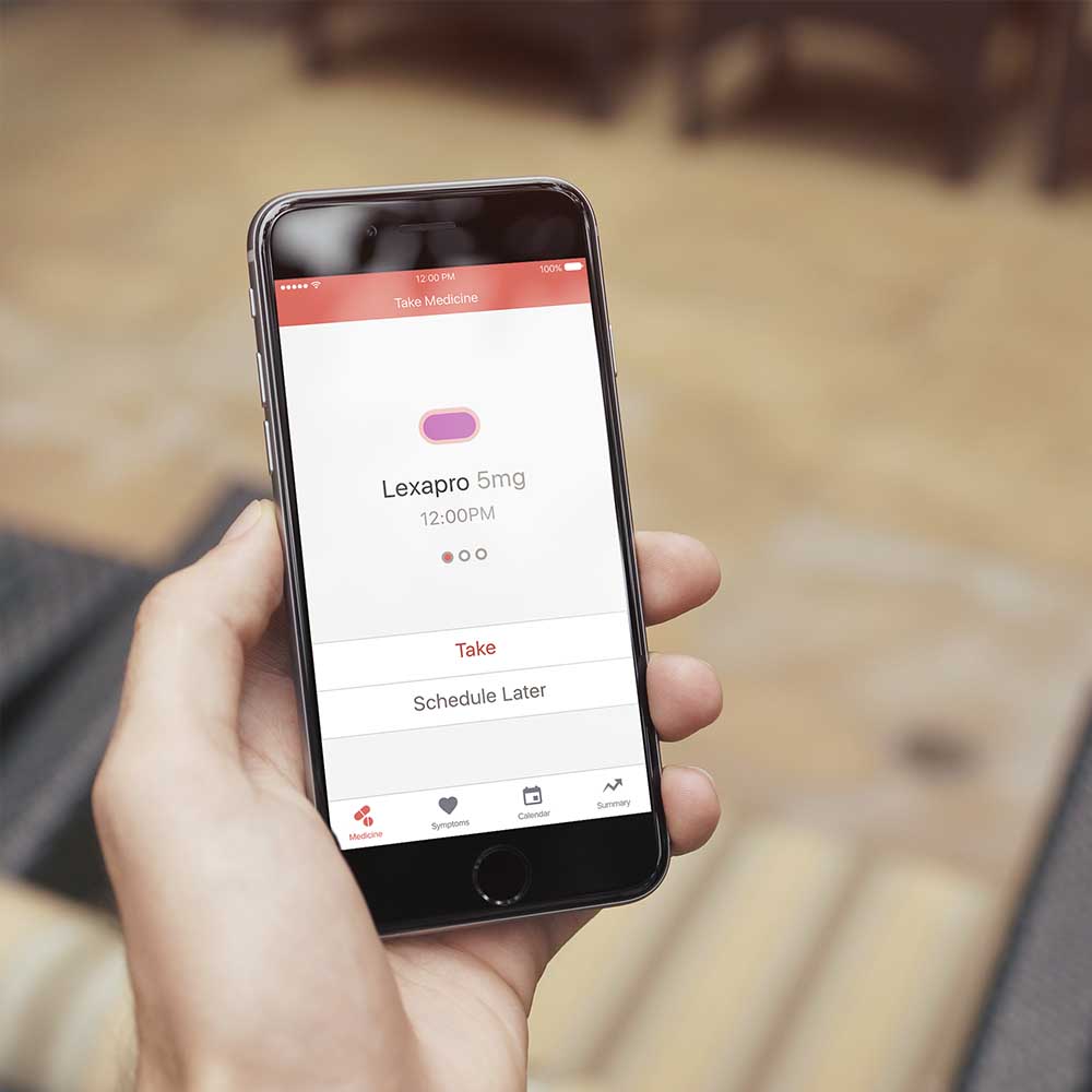
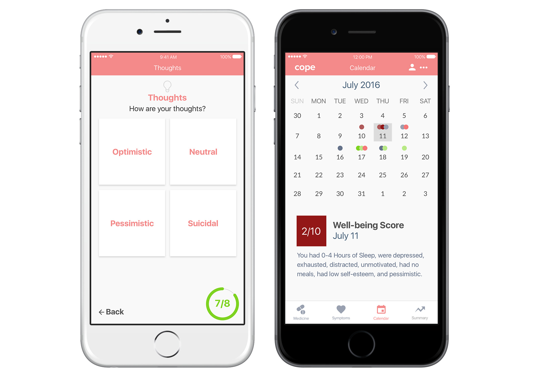
system, medicine tracker, calendar overview, and summary dashboard. All
modules work together to form a cohesive whole as a mental health
tracking platform.

Assumptions and Considerations
The boundaries of self-reporting and analysis
We cannot really derive a diagnosis from the self-report component of
the application because doctors are the only ones qualified to do it.
There are so many factors that relate to mental health, and we realized
as a team that the last thing that our app would want to do is to guess.
The design decision is to tally user’s progress based on his or her own
input, and we would assign a total well-being score based on the
aggregate of their answers.

Frequency of data collection
How exactly do we know if the emotion that was self-reported persisted all throughout
the day? As human beings, our emotions constantly change. We can’t do a
self-check just once a day because the data becomes inaccurate. We
decided to have multiple check-ins as the solution. That changed the
initial design I created for the calendar screen.
User Flow Brainstorming

Designing the onboarding process
The onboarding process starts with the user signing up or logging in and
keying important data. The user then performs his or her first symptoms
check-in. This is essential so there could be a baseline for his or her
data in the calendar and summary screens. He or she is led to an empty
state of the medicine tracker screen. From there, the user could add
medicine or check out his summary or calendar.
Hi-Fidelity Design
After asking so many questions about the product and validating
our assumptions with experts, I created different screens using Sketch.
There were multiple versions and ideas that I had to validate, and
frankly, I feel like I haven’t tested the solutions that I created yet.
During this phase, I got advice from a data visualization desginer if I
were designing the graphs correctly. I created a quick landing page as well.

Design Intentionality
There are so many nuances during the high fidelity design phase
and so we kept on going back to sketching all the time. I tried to be
smarter in thinking about the usability of each design. My focus was to
be more intentional in all of the affordances I create within the application.
Prototyping
I built the prototype
with Invision first but I encountered some problems with the tool.
MarvelApp proved a better choice. After building the prototype with
normal hotlinks, I believe we were ready to try it out with some users.
Guerilla Testing
I tested the application with 7 college students from Ateneo de
Manila University with convenience sampling. The results revealed some
usability questions for the app. What would the users actually do after
keying in their symptoms for the day? What if they do not have
medication ready? How can we get them to come back and actually use it
again? Indeed, there are many more things to design for the product that
we have not explored yet.
Next Steps
The project is actually in development now and the next step is
to conduct usability tests, install analytics and use new insights to
inform new iterations of the product. Design a better onboarding
process. Design for empty states. Design copywriting and strategy for
push notifications as trigger. Integrate a social aspect into the
application. All these will be helpful to create a better design for the app.

In reality, product design is the easy part. The real problems
we’re facing involve fighting a stigma around mental health, building an
open, supportive and vulnerable community, and creating a sustainable
business model for the product.
 View Prototype
 Download Feature Sets