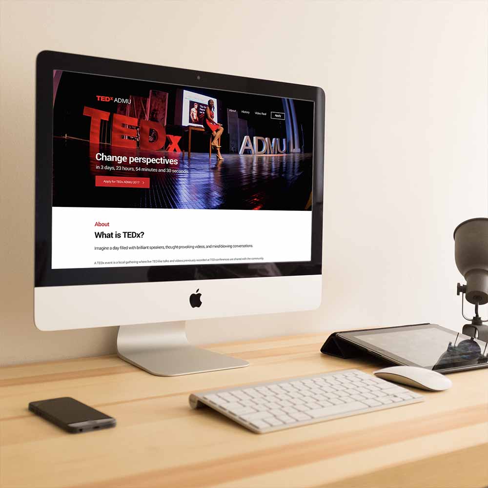
TEDxADMU is an independently organized community event that aims to spread ideas that inform and transform society. My role in the project was to design their website and make the application process as easy and seamless as possible.
Team Alexis Collado
Royce Chan
My Role Project Manager
User Interface Design
Front-end Development
Methods Contextual Inquiry
Google Analytics
Web Development
User Interface Design
I strategized, designed, and developed a simple landing page for TEDxADMU to set their application conversions to 66.8%.
"The partnership with UX Society was nothing short of amazing. Throughout the entire ideation and execution process, they have meticulously attended to our needs. The website that was created for us allowed more for applicants to apply. We’ve seen a boost in the amount of applicants that have accessed the website and applied after visiting. We’re really happy to have worked with Alexis’ team and even until now, they still continue to maintain and attend to our needs."
Nathaniel Benedicto
Associate Vice President for Events, Ateneo Junior Marketing Association
Context
The Ateneo Junior Marketing Association always outsourced their website development to different organizations in the university. This year, they chose User Experience Society, the organization I founded to create a strong digital presence for their flagship event. TEDxADMU is acclaimed among the youth and is marked by the many up and coming trailblazers in the Philippine community.
The Challenge
TEDxADMU always faced the same problems every year. How can we elevate the number of applications we receive? How do we communicate a credible and powerful presence online? How will our web copywriting, social media marketing, and word-of-mouth efforts convey the TEDxADMU brand as a cohesive whole? What platform will be the best to manage applications? How can we tell a compelling story through digital? As Consultancy Director of UX Society, I helped the organization answer these questions.
Contextual Inquiry and Discovery
After doing interviews with the main stakeholders of the project. I was able to do rough sketches of the product. The meetings were all about establishing trust and rapport with the client first and making sure I set the strategy for the project.
Moodboard
I asked the team I’m working with to come up with a moodboard to establish the visual language we want to use for the project.
Design Decisions
Since the TEDxADMU team has yet to finalize the complete details of the 2017 event, I recommended a three-phase release for the project.
The first release would be a teaser site where potential attendees learn about what the event is about, its history, and its talk/speaker playlist. Most importantly, I suggested that the design solution should focus on making it easy to receive applications. I decided it was best to go with a Typeform linked to the “Apply” buttons because of the product’s excellent form input experience. The team was also familiar with the platform and it will make it easier for them to process applications.
The second phase will focus on hyping up the event even more. Showcasing the speakers will be the core of the website experience. The third phase will be done post-event, where the centerpiece of the experience is about helping the attendees and non-attendees relive the experience. These phases have yet to be done.
Hi-Fidelity Mockups
Consistent Call-to-Actions The problem we wanted to solve was making sure people apply. This design delivers the best impact to solve that problem. Providing the context through photos and good copywriting was the only challenge left, since it’s a landing page.
Front-end Development
I coded the website in a duration of two days with my developer partner, Royce Chan. We made sure that the images were optimized for performance. I was very meticulous about the spacing of the elements and how close the final product was to the Sketch file I created. We also embedded the Typeform as an external link with the access granted from the TEDxADMU team.
Analytics
After crunching the data collected for the past two months that the site went live, the most recent statistic I got was a 66.8% conversion rate. I used the number of events and the pageviews to come up with the rate. I asked helped from my mentor, Mica from Nuworks, to figure out how to track click events and how to actually analyze the data.
Usability Testing
Doing a usability test using the think-aloud protocol with one user revealed some issues with the product that could easily be fixed.
Hero Copywriting Confusion The user confused the countdown as pertaining to the deadline of the application, when in fact, it was the countdown to the date of the event itself. There’s an opportunity to make the copywriting even more clear and precise in the next iteration.
Redundancy in Copywriting The user felt that separating the parts “What is TEDx” and “What is TEDxADMU” were irrelevant because they could have been combined. It made her feel that she didn’t want to read the TEDxADMU section because she already knows what TEDx is.
Navigation Inconsistency The user noticed that the anchor links on the navigation header corresponded to the red subtitles of the section content. She said that the “Video Reel” link on the top navigation should be renamed to “Talks” to stay consistent.
Confusion at The End The user felt that she reached the end of the page but she found out that she can still scroll down only to find a video. The user said that she felt it was lacking and compromised the whole experience.
Next Steps
Address Usability Issues from Testing There were a lot of issues that came up during the user test I did using the think-aloud protocol. I’m excited to work on the feedback so we can iterate on the current product.
Phase Two and Three For the rest of the project, majority of the efforts will be spent on designing an experience that builds up hype for the audience for Phase Two. Next, Phase Three will be about uploading the videos, insights, and learnings post-event.
Conduct More Usability Research I want to find more participants with diverse opinions on the product and hopefully find more issues with its use.
Case Studies
Selected Works
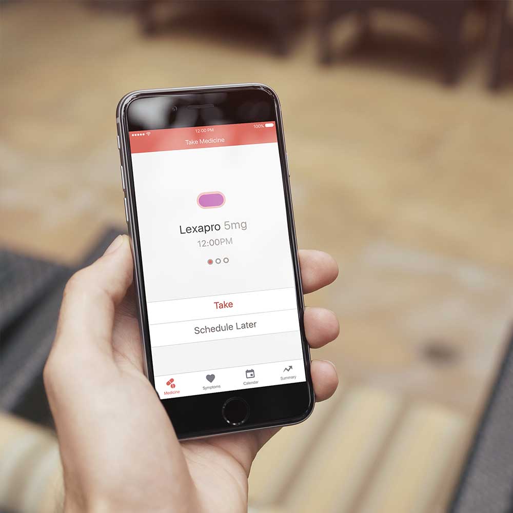
Cope iOS App
Mobile App Design
Cope is a mobile app that allows mental health help seekers track their symptoms and medication. I helped them create a minimum viable product for testing.
The TEDxADMU website was a project for the Ateneo Junior Marketing Association. It's a project where I helped them reach a 66.8% conversion rate from scratch.

 Download Feature Sets